By Jeremiah Willett
Let’s assume that we have done everything right on our self-service BI journey. We’ve built clean data models and have pristine data quality. Surely there is nothing that can ruin the project now, right? Not so fast! We still have a critical step to accomplish: selecting the right chart for our data. It is a common mistake for the dashboard developer to pick the fanciest chart rather than what best communicates the data. Picking the wrong chart can lead to confusion with the business users and will ultimately hurt adoption of the BI project. Here is a general guide to selecting the right chart for your use case.
BI tools like Qlik, Power BI, and Tableau have dozens of native charts to choose from alongside vast amounts of third-party custom visuals. With so many options, it can feel overwhelming to select the right one for your use case. In this article we will discuss four core use cases that will cover many of the scenarios you’ll encounter when building intuitive dashboards for your organization.
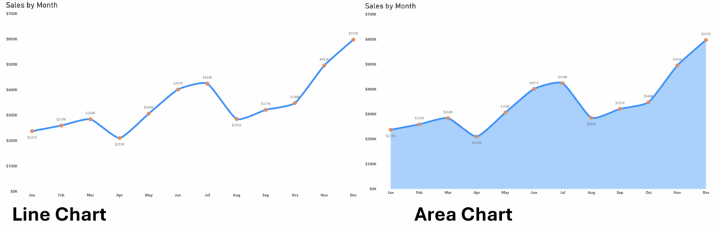
- Trends Over Time: Often a dashboard’s anchor visual, this chart is essential whenever your data contains a temporal dimension. For example, a sales dashboard needs a “Sales by Month” visualization so leadership can easily trace chronological momentum, cycles, or seasonal dips. Always default to a Line Chart for this because connecting the dots naturally guides the human eye. Depending on your needs, you can leverage advanced variations like Area Charts or Stacked Area Charts to emphasize total volume and part-to-whole trends simultaneously. Avoid the common mistake of using bar charts for extended timelines; with 12 or more data points on a calendar year, bars disrupt the visual flow and heavily clutter your canvas real estate.
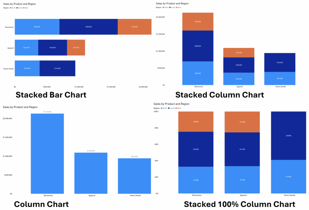
- Comparing Categories: When your goal is to show how discrete, non-temporal groups perform against each other, such as Sales by Category or Sales by Region, the Bar or Column Chart is your best friend. This visual uses the human brain’s natural ability to compare relative length of parallel bars to instantly recognize over and under performing groups. A good rule of thumb is to use a vertical column chart when you have a small number of categories and a horizontal bar chart when you have many categories. Avoid placing long category names onto a vertical axis as this will lead to messy and difficult to read column titles. You can choose from three main structural variations: Clustered charts place bars side-by-side to compare separate metrics, Stacked charts place sub-categories end-to-end to show total volume alongside internal parts, and 100% Stacked charts stretch all bars to an equal width representing 100% to strictly compare percentage distributions.
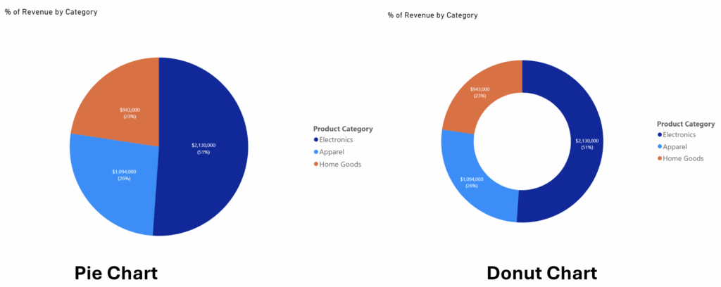
- Parts-to-Whole: If you need to show how individual categories contribute to a grand total, such as what percentage of revenue comes from a specific region for a company, then you are dealing with a composition use case. The best way to visualize a composition is either a Donut or Pie Chart. These visuals allow users to instantly grasp the revenue contribution of each category, using the relative size of each slice to tell a clear comparative story. Developers should avoid using either of these visuals if there are too many categories in the dimension so as not to cause cognitive overload. If there are more than 6 or 7 categories in the dimensions, it is best to use a Treemap or Bar Chart visual.
- Tables and Matrices: Charts are perfect for high-level analysis but sometimes the best way to visualize the data is a table or matrix. Particularly when the user wants to see raw precision mapped across intersecting dimensions, allowing them to extract exact data points down to the penny. A Table is a flat, two-dimensional list of details, whereas a Matrix (or Pivot Table) is a multi-dimensional grid that aggregates data across both rows and columns simultaneously. Always use a matrix whenever possible. Additionally, utilize Conditional Formatting such as subtle background gradient or data bars to easily show high performing categories without losing access to the underling exact dollar amounts.
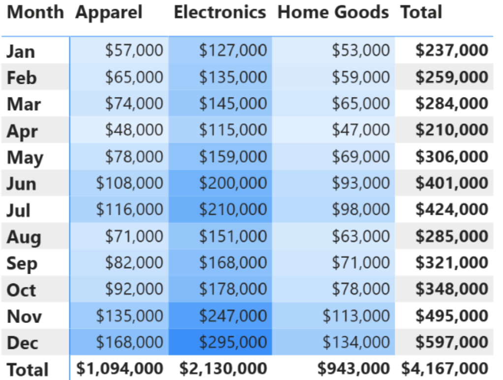
Matrix
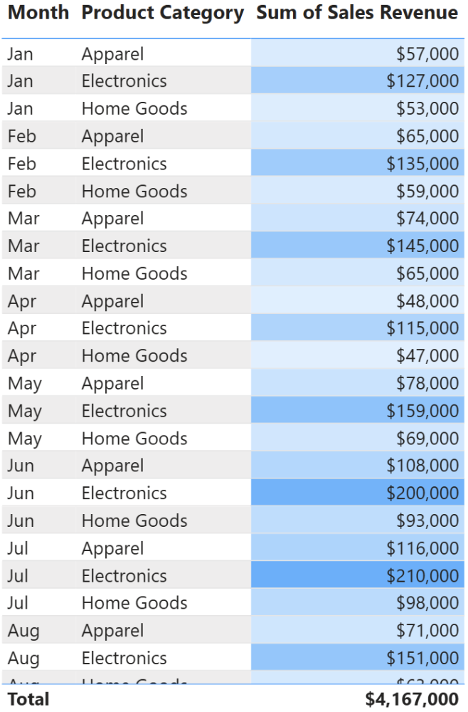
Flat Table
Conclusion
While modern BI tools offer an ever-expanding library of specialized visualizations, mastering these four core categories will successfully cover the vast majority of your everyday business use cases. Ultimately, the most technically advanced chart is worthless if it confuses your audience. The goal of a dashboard developer is to deeply understand and design for the unique operational needs of the business user, translating dense data architecture into clean, scannable, and actionable visualizations that drive confident organizational decisions.

Jeremiah Willett, CDMP: Empowering Smarter Decisions with Data
He is an Associate Manager of Data Engineering at Data Principles, where he helps organizations turn complex data into clear, actionable insights through innovative business intelligence solutions. With experience across SQL, Qlik Sense, data integration, and project management, he is passionate about empowering organizations to make data-driven decisions. Jeremiah also serves as the Vice President of Finance for DAMA Phoenix and holds a Certified Data Management Professional (CDMP) credential.
Join Our Data Community
At Data Principles, we believe in making data powerful and accessible. Get monthly insights, practical advice, and company updates delivered straight to your inbox. Subscribe and be part of the journey!